
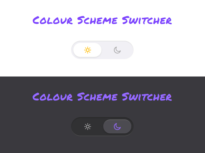
Colour Scheme Switcher — Interactive HTML Email Experiment
Inspired by a beautiful dark mode toggle design on Dribbble, I decided to translate this for use in email.

💡 The idea
One day, while perusing Dribbble for interactive email design inspiration, I stumbled upon this lovely little dark card UI design.
Lately, I've had a real desire to build out some of the amazing web & mobile design work that is constantly being shared on Twitter, Dribbble, newsletters and a myriad of other places.
This toggle design really stood out to me and stumbling upon it coincided with some research I was doing into colour scheme toggles for fun, which is something I find enjoyable apparently...
🔨 Build - The Basics
Building a toggle is actually really simple.
A checkbox with one label or two radio inputs with two labels. The labels are then used as a click/tap area to trigger the 'checked' state on the checkbox or respective radio input and then our CSS will shift the handle/indicator to the specified position.
Example:
I've outlined the labels in red. Have a click around to see how the two different techniques work.
The difficulty with builds like this comes when you add visual complexity, like in my final build where I've included lighting and shadows.
In general, it's all about using CSS to check for changes on your inputs and then styling your views for the different scenarios, i.e. disabled / enabled.
Example:
.traffic-light { background-color:red; }
#green-light:checked ~ .wrapper .traffic-light { background-color:green; }
This toggle could be pushed further with more options added to transform it into a slider. We simply add more radio input options (checkboxes won't work here unless you want a multi-choice slider, if that is a thing), lengthen the track and add CSS to tell the handle to travel further for each added option, when selected.
Example: (may not work too well on mobile)
At Mayoris, we utilise sliders in our interactive email API - Mailix, for our clients to pull into their survey builds for NPS ratings or as an alternative to a list or grid of radio input options.
And the work to adapt this to a horizontal layout for mobile is quite simple.
Radio or Checkbox?
Back to the toggle...
Before we make it look pretty, we need to choose between the radio and checkbox methods.
My thinking here is:
- Two radio inputs means the user can see that they are explicitly enabling either colour scheme. This will work well for a larger toggle to allow for the same functionality on mobile, without having to rework the element.
- One checkbox means a smaller toggle can be used and simply tapping the toggle element as a whole will toggle between the two states.
I'm more of a fan of explicitly telling the user which setting they'll be enabling upon click/tap, plus I'm building the toggle to be quite large, so the radio input option (option a) just makes sense.
🔨 Build — Make it Glitter
We want the colour scheme state to affect the entire body. To make this work, the inputs need to sit above everything else. The reason being - we watch the inputs for changes (unchecked / checked) and once a state change is made, we then use CSS sibling selectors to run down the HTML to find and style our elements accordingly.
Example:
This is one of the selectors I'm using to switch out the dark mode icon when enabled.
#dark-mode:checked ~ .wrapper .toggle .dark { ... }In shifting the inputs to sit above everything else, I dropped them directly below the body tag (the highest in the heirarchy we can go), with the wrapping content div following closely behind.
I then added a class of 'wrapper' on that wrapping div and now I can check for the checked input state, select my sibling .wrapper div and now I have access to my content structure for styling.
If you've taken a look at the source code, you're probably (rightly) horrified. That's a lot of CSS just to switch the styles of an element and the body, for each colour scheme!
And then we have a dark mode media query with styles that force the light mode colour palette on devices that have dark mode enabled but the light mode option enabled in the email.
Baaaaaah 🤯
That's just the way it is for a detailed build like this.
It's beautiful and I find technically challenging builds like this fun, but it was a pain in the butt to build at times.
To be fair, I've gone all out to build a beautiful toggle. I mean, I even Skeumorphised this with shadows & lighting. This could be simplified in so many ways to reduce the number of elements that are being adapted for each colour scheme.
Just look at my toggle examples in the 'Basics' section. They're super basic and with the right colour palette, you can easily show the different states of the toggle, without going over the top like I did.
I know I didn't go into too much detail on adapting the styling to suit the final result but I wanted to keep this tutorial at a reasonable length. Plus, this is mostly basic CSS styling. The intricacies are in the selection of each item and linking them with the :checked state on the radio inputs.
View the final experiment and comb through the source code to really see how each state change on the radio inputs is affecting ALL of the other elements. It's all yours to play with, adapt and use as you wish.
🤔 Final thoughts
I do want to make it clear that I am a big proponent of pushing email to it's limit, especially when it comes to mimicking web functionality in email and I am a firm believer that innovation is the avoidance of stagnation.
Someone quote that ^ 😅
This innovation could make sense in email or it could be experimenting web & app functionality to open up gateways to more practical solutions for email.
Our community is exploding with development talent and excitement around being an email developer and that is all thanks to the years of innovation by the previous wave of developers - who were confined in an old box with sides that don't conform, at the bottom of a pile of other boxes while being a sitting duck to random acts of God (Word rendering engine) that flood, water damage or burn the box.
Ridiculous analogy, I know but no more ridiculous than trying to explain email development and all of it's quirks to a layman.
Hmm... I feel another blog post coming on.
Point is, let's not allow our development capabilities in email, to stagnate. This toggle experiment is merely a gateway to more practical usecases.
This is what we need more of in our community - idea exploration, documentation and sharing of the findings.
Expect a lot more of this from me.
Thanks for reading, fellow geek.
Niven
