
Offset Shadows - Email Experiment
With the introduction of the Faux Absolute Positioning Technique, I've been on the lookout for design challenges to push the technique even further. I've specifically been looking for designs with multiple objects layered over the top of each other or intersecting each other. However, that's not so easy for email.
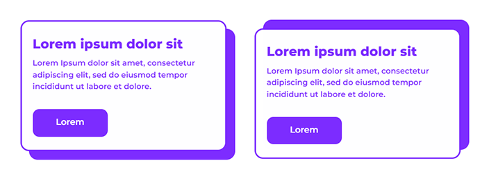

Today we're specifically looking at this offset shadow design on Dribbble. This is definitely an example of a design feature that isn't easy to implement in email.
Let's quickly look at the options we usually have:
- CSS Box-shadow.
- Adding rows and cells around the card structure with clever use of fill colours and sliced images of rounded corners.
- A background image.
In detail:
-
Box-shadow doesn't have great support in email clients (caniemail.com).
-
Adding a table structure around the card could work really well and allow for easy adaptation to different lengths of content and mobile responsiveness. However, will pose problems in dark mode, with the use of images to achieve the rounded corners.
-
Finally, background images... I’m no longer a fan of defaulting to background images. Faux Absolute Positioning is now my go to for layering content. Background images absolutely have their place but we can now be more exploratory when we're translating complex designs or even web designs for email.
Faux Absolute Positioning does have similar restrictions to background images. You still need to set a width & height to ensure the background and foreground match, so it's not perfect. I also encountered some dark mode issues in Outlook & Office 365 on Windows (which I'll now refer to as 'MSO clients') due to the VML required, but I'll get into that later.
🧐 Code review
Visually the elements look great. Code wise, maybe not so great. Unfortunately to support as many email clients as possible (which I achieved), I needed a lot of code for visual consistency across the board.
Let's dive in.
🔨 Build - Breakdown
In terms of the actual implementation, it's not too dissimilar to the original examples.
A content block, stacked above a background block. Max-height to zero out the content block wrapper which then tricks the background block to shift upwards to fill the gap. And the content inside of the content block wrapper continuing to fill it's intended space and rendering above the background block.
For the purposes of centring only, I have wrapped each module in a table. Fiddling with centering divs and then trying find a fallback option for MSO clients proved cumbersome. There is probably a simple way to get this working but for the purposes of this experiment, I'm not really trying to avoid the use of tables and I'm not going to over complicate this with ghost tables.
1. Content Block - Wrapper
We have the first of two divs. This is our content block wrapper which we use to trick the rendering engine.
Inside of that there are two divs (which swap out), to account for different rendering results between T-Online and the rest of the clients which support this technique. T-Online doesn't like position:relative, so a workaround in the form of an alternative div is used for T-Online only.
The first version of the content block wrapper is the one we use for the majority of email clients.
<div style="max-height:0; max-width:480px; position:relative; opacity:0.999;">max-height- Zero out our height to pull the background block upmax-width- Really, this helps with smaller screens however, I haven't actually set this up to be repsonsive.position:relative- With the above tricks, the content block renders below the background block. Adding this property enablesz-indexelement layering (without needing to declare the actual property) and then pulls the content block up to sit on top of everything else. Now, this property isn't supported by every email client and so we also need theopacityproperty.opacity:0.999- This will get around any clients that do not supportposition:relative. The opacity drop is negligible, so don't worry about the figure.
Mark Robbins goes into detail on the last two points above. Please take a look at his write-up Faux Absolute Position on his website Good Email Code.
The second version of the content block wrapper is the T-Online specific div.
<div style="max-height:0; max-width:480px; opacity:0.999;">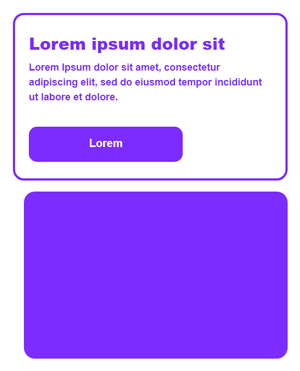
Altogether now:
    <!--[if tonline]><div style="display:none"><![endif]-->
    <div style="max-height:0; max-width:480px; position:relative; opacity:0.999;">
    <!--[if tonline]></div></div>
    <div style="max-height:0; max-width:480px; opacity:0.999;">
    <![endif]-->
Something I also want to cover off:
Ordinarily, the recommendation when you do have the opportunity to use conditionals to fix outlier clients, is to make changes via CSS.
We already know T-Online has a condition we can utilise. However, at Mayoris we have a T-Online test account, so I have the advantage of opening a test send and utilising DevTools in Chrome, to dig through the final code.
Doing this, I can see the client is actually stripping that div of all of it's CSS properties when position:relative is defined. Removing that property or changing the value to static, avoids the issue.
With this in mind, I removed the conditions and the extra div and added a class to the div and then tried setting a conditional CSS change in the head.
<div class="stat" style="max-height:0; max-width:480px; position:relative; opacity:0.999;"><head>
. . .
<!--[if tonline]>
<style id="tonline-styles">
.stat { position:static!important; }
</style>
<![endif]-->
</head>This didn't work.
Why?
I don't know for sure and once I saw this issue, I kind of lost interest in trying to pursue this via CSS. My guess is T-Online strips the head CSS. That's certainly what it looked like in DevTools. All of my base styles and resets weren't there.
I have a fix working in HTML and even if this was a client build, I can see that spending more time on this actually isn't worth it.
Best thing to do is move on.
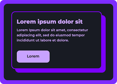
2. Content Block - Foreground Card
Next, we dive into the card design.
<!--[if mso]>
<v:roundrect fill="t" stroked="t" strokecolor="#7d2cff" strokeweight="4px" arcsize="6%" style="position:absolute; top:0; width:480px;">
<v:textbox inset="0,0,0,0" style="mso-fit-shape-to-text:true;">
<![endif]-->
<div class="card" style="background:#fff; border:4px solid #7d2cff; border-radius:20px;">
<table border="0" cellspacing="0" cellpadding="0" style="width:100%" role="presentation">
<tr>
<td class="card-font" style="font:600 18px/1.5 Montserrat, sans-serif;color:#7d2cff; text-align:left; padding:30px 25px;">
<h2 style="margin:0; font-size:30px;line-height:42px;font-weight:800;">Lorem ipsum dolor sit</h2>
<p style="margin:10px 0 40px 0">Lorem Ipsum dolor sit amet, consectetur adipiscing elit, sed do eiusmod tempor incididunt ut labore et dolore.</p>
<p style="margin:0"><a class="button" href="https://bare-bones.dev" style="font:600 20px/1 Montserrat, sans-serif; background:#7d2cff; text-decoration:none; padding:16px 50px; color:#fff; border-radius:15px; display:inline-block; mso-padding-alt:0; border: 4px solid transparent;border-bottom: 8px solid transparent;"><!--[if mso]><i style="letter-spacing:50px;mso-font-width:-100%;mso-text-raise:20pt"> </i><![endif]--><span style="mso-text-raise:11pt;">Lorem</span><!--[if mso]></span><i style="letter-spacing:50px;mso-font-width:-100%"> </i><![endif]--></a></p>
</td>
</tr>
</table>
</div>
<!--[if mso]>
</v:textbox>
</v:roundrect>
<![endif]-->I use the div to set the background colour, purple border and border radius for everything other than MSO clients. I then declare a table inside of that to help with maintaining the ability to use padding in all clients.
And to finish up, we wrap the whole element in VML for the MSO clients.
Now it's time to touch on the dark mode issues.
The <v:roundrect> has the fill set to t/true. This is due to the div background colour not applying in MSO clients and I also can't set this on the nested table as doing that resulted in this monstrosity 😵💫:
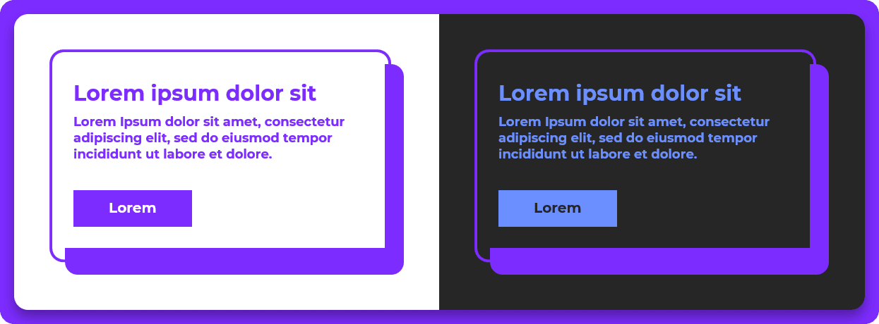
With the fill on the <v:roundrect>, we get this instead:
The content & button colours are off in dark mode, which is simply down to the dark purple I use, not having the appropriate contrast ratio.
Using the old trick of:
- Opening MS Word
- Typing some text
- Setting a gradient on the text
- Saving the document as an HTML file and then viewing the source
Which is what Nicole Merlin did to get her amazing MSO client dark mode fix, I was able to set a lighter purple to more closely follow my normal palette. However, with setting the lighter purple, that then affects my light mode styling too which wasn't great. For now, I'm leaving the blue. It's fine. Again, not a client build, so moving on.
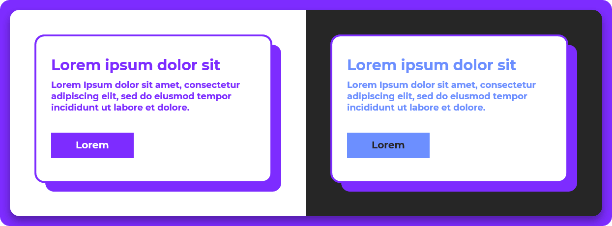
Dark mode rendering everywhere else looks great.
Here is Apple Mail for example 😎:
🧐 Conclusion
In general, I don't necessarily think this is an ideal solution for all use cases. The code weight of the HTML of one of the modules included in the example is only 3kb. That's pretty surprising.
Thanks for reading, fellow geek.
Niven
