
Parallax in Email with fallback - Email Experiment
Please note: This is not a mobile responsive project, so things will look squeezed and positioning on mobile will be out, but the main workings should be intact.
Here is a fun little project I've been tinkering with for a wee while. I have wanted to play with an abstract email challenge for a long time but I just haven't had the right project to spark that fire that makes me obsess over an idea.
One night this ad for Gousto (a recipe box company in the UK), popped up while we had the TV paused:

I instantly thought of my favourite technique, faux absolute positioning. While I wouldn't be able to recreate the design without the original image (which I couldn't track down), I could take the premise and find an equally intricate image to pull off the same effect.

🏗️ Setup
I scoured stock imagery sites until I found an interesting image:
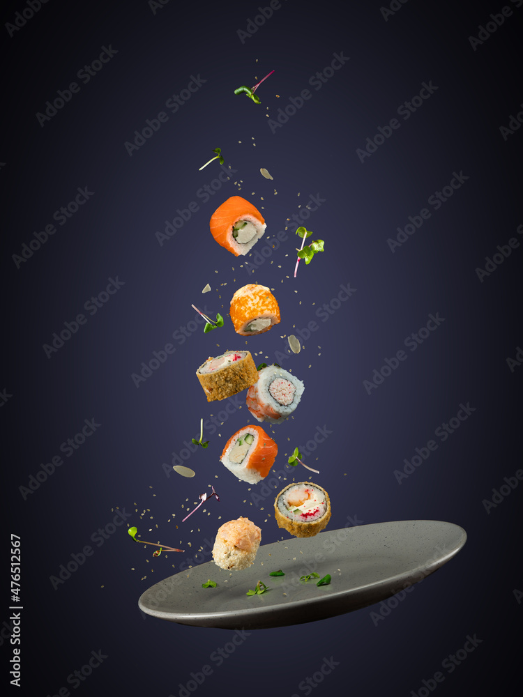
First port of call was to remove the background and then split the elements up into separate layers so I could insert some text in amongst everything.
Here is a simple mockup I created once everything was cut out, to get an idea of how I could build it:

I'm not great with words and "I love Sushi" was the best I could come up with 😂
I tweaked it slightly during the build, to include a heart shaped piece of sushi so it reads slightly better now, but I digress.
In the end, there will be some overlap between the layers, but the main goal is keep that text as live text.
It was around this time I remembered that I've always wanted to attempt a parallax effect in email. This technique was new to me, in implementation. Even on the front end, I hadn't ever used or even played with CSS based parallax, so I had some homework to do before I could see if this would even work in any email clients.
But first, some reflection.
🫗 One for the homies
In the past, the community has come up with a great alternative to parallax, in fixed/absolute positioning. A great example of this is the infamous Taco Bell email by Heidi Olsen. Heidi was kind enough to share a little background and the actual code to this email.
Well worth a look if you haven't seen it before:
Email on Acid then built their own version a year or so later, improving on Heidi's idea, with better email client support, utilising… faux absolute positioning! That technique just gives and gives and gives.
Again, well worth a look to see where they made improvements over Heidi's idea.
And there are plenty more examples in our community, I've only scratched the surface.
🧮 The game plan
Going into this, I knew most of the ins and outs of the faux absolute technique, from my work on the multi-axis faux absolute module for a client project at Mailix, so I knew the approach to take and the email client support.
I also knew that parallax wouldn't be easy, otherwise we'd see it used more often. And if it was supported even in one email client, it would be treated as a progressive enhancement on top of a more solid base. And that was my goal. Faux absolute as a strong, well supported base for the majority of email clients and parallax as a bonus, if it is even supported.
I mentioned this earlier but I think it's important to note again - I decided not to go down the rabbit hole of making this responsive. I just wanted it to work and there is so much positioning involved that it would be a hell of a job adapting everything as the whole project scaled. If you test this out, you will definitely see some small positioning issues on mobile, but that's okay. The main point is to show parallax working in Apple's own mail client(s).
🛠️ Main build
I urge you to look into the faux absolute positioning technique if you haven't already. Basic premise is to wrap all of the elements you want to layer over the top of each other, in divs (I've only tested with divs, but may work with a span or even a table) individually, set the max-height to 0 on those divs which in-turn makes them trick each other into thinking everything is zero'd out. Then play with the max-height value of each div to push surrounding elements down or use absolute positioning, margin or padding to push your elements around. Outlook still requires VML to make this work but VML supports position absolute which is way easier to use 🎉🎉🎉
Here is the base build with wording tweak included 😉:

Rendering results were as expected. It worked everywhere except GMX, Web.de, T-Online.de and Comcast. Comcast I can't do too much about as I'm not US based and cannot get an account to test.
GMX, Web.de, T-Online.de all require inline CSS. This project required a fair amount of CSS because of the targeted fixes, so I'm not going to set up the inlining just for these three clients, considering it's an experiment. However, it would be simple enough to fix for a typical faux absolute + parallax build with full width blocks and a few small elements layered over the top.
tl;dr - I can't be arsed fixing the build for these clients since they've made it incredibly more difficult to code emails. It's just silly and ultimately this is just an experiment.
🪄 The magic
And now the fun but laborious process of getting an understanding of CSS based parallax.
First and foremost, it is imperative you read up on this technique using the best resources available.
- Keith Clark's Pure CSS Parallax Websites - a lot of detail and scenario work in this how-to. Keith includes some good examples to illustrate how the CSS mimics layers and then how they work with helpful interactive & scrollable diagrams.
- Chrome Developers Performant Parallaxing (originally written by Paul Lewis) - another in depth breakdown with some basic examples of how the properties work in conjunction.
- Mark Robbins also adapted one of the examples included in the Chrome Developers post, for his testing in email clients.
This technique is heavily reliant on these three properties:
perspective- defines the distance of an element from the user.transform- value oftranslateZ(#)determines the layer depth and subsequent scrolling speed +scale(#)scales the element back up to the originally intended size.transform-style- value ofpreserve-3dindicates the children of the element, will be positioned in a 3D space.
First thing to do was to check all of these properties in caniemail.com.
perspective- not documented yet.transform- has great support but that is to be expected as this property isn't specifically for 3D CSS.transform-style- not documented yet.
That is unfortunate, but understandable. Two of those properties aren't in everyday use for email. Ahh well. Time to test.
I sent Mark's adapted parallax test to Litmus first, to see if transform:translateZ(#); was being respected. Without this, the scrolling speed variance can't be set, to give the illusion of distance. Thankfully it was working in Apple Mail, but the 3D properties weren't taking any effect in any other client.
While the translateZ value was being respected in Apple Mail, I still needed to test if the scrolling speed variance effect worked, which I can only do with a manually manipulated Apple device. Weird wording, but you'll see what I mean shortly.
I only have a Windows laptop and an Android phone. My partner has an iPad but she gets a lot of use out of it for her business and artwork and I need a more accessible option, especially when I'm running rounds and rounds of tests. My best option was to set up a virtual Mac on my laptop and reserve the use of the iPad for some final testing. Setting the VM up took maybe a couple of hours including research, downloading files and then setting up the latest available version of the OS.
With that all set up, sending the test to my new test iCloud address, I could see the scrolling working as expected 🙀
It may not look like much but think about how all of those elements would usually react or rather not react when the viewport scrolls. They would stay static, keeping their initial distance between each other while the body shifts up. However, in this test, the distance between each element changes. That is the scroll speed variance I'm on about. The scroll speed of each element differs and so they are individually reacting to the scrolling action of the viewport.
Now, on to testing the properties on my build. Unfortunately, it wasn't as easy as applying the parallax properties to my faux absolute base to enhance the build for Apple Mail. The 3D properties completely throw out the faux absolute positioning values.
I found that I had to set up separate positioning values for the parallax build. And to be honest, it was just less of a headache overall having the approaches split up in styles blocks in the head.
Once all of the elements were set up for the parallax build, I fired off another test to iCloud.
Boom! Winner winner chicken dinner!
🪛 Fine tuning
I now needed to ensure my parallax property overrides are enabled in Apple Mail and leave the faux absolute base in place by default.
The always reliable howtotarget.email gave me this selector to target all Apple Mail from version 10 and up:
.Singleton .your-class-name {
	/* Replace this comment with your styles */
}
This only enabled it for desktop and so I found this combo of selectors in an attempt to enable the build for ios mail on iPads and iPhones:
@media only screen and (min-device-width: 768px) and (max-device-width: 1024px) and (-webkit-min-device-pixel-ratio: 2),
(min-resolution: 2dppx) and (hover: none) {
  _:-webkit-full-screen,
	_::-webkit-full-page-media,
	_:future,
	:root body:not(.Singleton) .your-class-name {
    /* Replace this comment with your styles */
  }
}
However, I encountered some conflicts. I tested a bunch of variations of that combo but found reducing it down to just this selector, did the trick:
:root body:not(.Singleton) .your-class-name {
	/* Replace this comment with your styles */
}
Again, these two sets of selectors are split up into two separate style blocks, so they're easy to distinguish. I now have three, one for faux absolute and two for the different Parallax enablers, depending on which Apple device you're on.
With the selectors in place, I could now see smaller iOS devices showing my build and so it was finally time to steal my partner's iPad for a live test and oh man, did it not disappoint. A bonus was seeing how smooth the parallax effect looks on an iPad. Especially when you scroll back to the top and see the rubber band scroll bouncing effect, accentuates the beauty.
🧑🏾🦯 Accessibility
🌀 Reduced Motion
Obviously, with parallax comes motion and especially with this build and the many variations on the scroll speed etc, I thought it would be best to include a way for the build to be respectful of everyone's preferences. So, my two Parallax style blocks are now wrapped in a no-preference reduce-motion media query.
E.g.:
@media (prefers-reduced-motion: no-preference) {
	...
}
Now, when a user has set a device motion effect setting off on their device, the faux absolute position build will render, if on a device (online view) or in an email client (Apple Mail / iOS Mail) that supports the required properties.
🖥️ Screen Readers
There wasn't a huge amount I needed to do here:
- There is only one line of text, the H1. It's live text, so assistive tech friendly and can be translated into other languages.
- The majority of the images are decorative and the text gives context to my message.
- The one image that will need to give context is the heart shaped sushi nested inside of the H1.
Let's tackle point 3:
Simply adding the word "heart" to the alt attribute will then mean a screen reader will read:
heading
level 1
I
graphic
heart
Sushi
*Using Litmus' NVDA screen reader
The announcement of a graphic being included in the middle isn't ideal, as it breaks the flow of the text and may also in fact break the context I want to include. So instead, I've opted for hiding the image from screen readers by leaving the alt attribute empty and instead adding a screen reader only string with the text "heart".
Those who can see the imagery, will see:
"I ❤️ Sushi".
Those using a screen reader will hear:
heading
level 1
I
heart
Sushi
Or:
"I heart Sushi".
I went with "heart" for screen readers, so the context matches, no matter how you consume the content.
Is that the best approach? I don't know. My aim is to give as close to the same experience to everyone and I think that is what I'm doing. Happy to be corrected though.
🏁 Conclusion
Obviously this is an extreme example of how to use a combo of faux absolute with parallax as a progressive enhancement, but for me that's the fun of learning new techniques.
I find it difficult to pick up advanced techniques just by reading, in fact I very often inadvertently wander with my thoughts and get distracted and have to reread long posts, many times abandoning them. And usually I learn something new while in the middle of a project, rather than building a test specifically to learn that new thing. That helps keep me engaged because I'm deep in thought on how to achieve something for a client or excited to build a crazy idea, like this.
The thrill for me comes with the initial excitement of an idea, the frustration of my implementation of a new technique into my project not working and then the overwhelming feeling of accomplishment of getting over that hurdle and sharing it with others.
I hope that inspires others to experiment, whether it be with something like this or just a crazy idea they have.
Thanks for reading,
Niven
